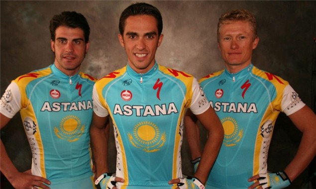
Sky and Astana team kit
Professional cycling outfits Team Sky and Team Astana both revealed their 2010 team strips last week. Their release of which draws into question the merits of good versus bad, beautiful versus ugly, pleasing versus revolting team kit.
First, the Astana team strip. Little has changed since last year, which means it’s still as horrid to the eyes as before. It continues the European-led trend for bright, brash and garish designs, mixing colours that clearly do not blend together harmoniously. And to make matters worse, the bright red Specialized logo has been added which little thought to aesthetic harmony. Another horrible jersey to afflict the professional peloton whirring otherwise beautifully through a sun-dappled landscape.
Meanwhile, Team Sky has opted for a simple design with a dual tone that is elegant in its simplicity. It’s neither ground-breaking nor daring but, with a large band across the chest, a historical reminder of the classic jersey designs of the 1960s and 1970s. Boldly, the rear of the jersey is all white with a thin blue line running down the centre, a simple motive that alludes to the team’s philosophy. It may not be revolutionary but, in keeping things simple, the designers have produced a stylish and understated team strip that is sure to age well.
Regardless of which kit you prefer, what really matters is which is first across the start line. And for that answer we’ll have to wait until the two teams clash for the first time.


