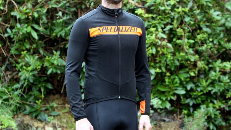
Cycling is one of sport’s most colourful spectacles and the sheer quantity of different designs in the peloton is one of the main reasons for that.
Kit designers also find a lot more freedom in cycling, but also have to contend with more commercial pressures than other sports. And if you couple that with sponsors changing all the time it’s unsurprising that you don’t find as much kit continuity as in a sport like football. That means that over the years we’ve seen countless designs. Some of them great, others, well, less so – and it’s normally those designs that stick in the memory…
Team kits can be just as divisive as the riders who wear them and given that choice in clothing matters tends to be rather personal, I should warn you that some of you might hate the choices further down the page. With that in mind, when putting this list together I figured I’ll pick whatever I want. If you don’t agree with the choices – or have some examples of others that should be here – let me know in the comments.
Oh, and you know how a lot of riders say you should never wear team kit? You’ll see some of the reasons why below. What you might think is cool now may well turn into something you’re ashamed to wear once that team is dead and gone…
The good…
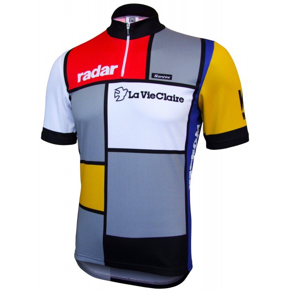
La Vie Claire
Two pretty good guidelines when designing are kit are to keep it simple and, if possible, use the work of an artistic master. La Vie Claire followed both of these when they adapted the work of Dutch painter Piet Mondrian, father of an artistic school known as neoplasticism.