Share

How To

How to train with a power meter – part five: how to analyse a power training file

Understanding the key metrics to better inform training with power

While many riders will be tempted by the prospect of using a power meter to advance their training, the key is in understanding the data it produces, in order to make sure you’re getting exactly what you want out of each session on the bike.

Once you have put together a training plan, as I detailed in the previous instalment in this series, and completed a session, you need to be able to analyse the training file to track your improvements or identify any areas that need more work.

However, analysis of a power file can be very complex process – and, not to mention, confusing. With increasingly powerful analysis tools such as WKO4, Golden Cheetah, Training Peaks and Strava, every session can be broken down into minute detail – but don’t let this stop you from understanding the basics and analysing your own training files.

Riding with a power meter is one thing, using the data effectively is another (Pic: Verve Cycling)

As a cycling coach, every time I look at a power file from one of my riders I start by using the metrics below to compare the results of the session to the pre-planned goals of that session. These goals are defined by the training period the athlete is in (head back to my article on constructing a training plan for more on that).

[series]

For example, during a block of training where we are working on a rider’s threshold, I will be looking at the quality and quantity of the zone four efforts. I will then use the metrics and graphs explained in this article to assess how the session went, what was good, what still needs work and what factors were limiting performance in the session. I will then look at where the session fits into the bigger picture, as defined by the macro and meso cycles of the training plan, before making a decision on future sessions, based on a combination of the overall plan and what I have seen in the training file.

If all that sounds complicated, then what we’ll do in this article is cover the basics so you start analysing your own files at home – something you should be doing even if you work with a coach. Over time you should be able to see improvements in certain areas, or identify areas for improvement, rather than simply relying on your coach to point them out – or, worse still, guessing.

It takes time to fully get to grips with the data but, as you become more comfortable with the numbers, it’s great for your motivation to understand how your body is reacting to the training and improving as a result. If you work with a coach, it will also enable the two of you to communicate better.

Here are some of the most commonly used metrics and graphs you’re likely to see when analysing a training file, along with some insight into how I use them as a coach. I’ve used Training Peaks here as it’s the most popular software, but you’ll see similar numbers and graphics in a number of packages.

Normalized Power (NP)

First of all, we need to cover something known as Normalized Power – it’s a key figure as a lot of metrics are based on NP. If you’re already using a power meter, you may have noticed your NP is often higher than your average power – some riders quote their NP just because it is more impressive.

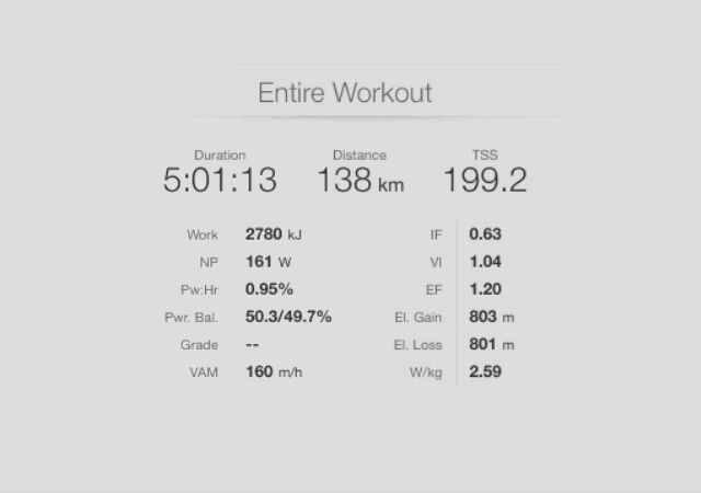
These are some of the key numbers you’re like to see when analysing a power meter file – but what do they mean? In this article, we’ll take a closer look at NP, TSS, IF, VI, EF, Pw:Hr and VAM (Pic: Training Peaks)

Put simply, NP is a best guess at an average power, representative of the effort you put in over the course of a ride. Let me give an example – if you rode for three hours and in the first hour you rode at 150 watts, in the second hour you rode at 200 watts and in the third you rode at 250 watts, then the average power would be 200 watts.

However, the ride would feel harder than riding at 200 watts for three hours because of the extra effort at the end. As a result, the NP for this ride would actually be 212 watts – a ‘best guess’ at the physiological cost of an effort. We won’t get into the actual equation here but it should be noted that NP cannot be calculated for any effort shorter than 30 seconds.

Training Stress Score (TSS)

Training Stress Score is a metric used in Training Peaks and is a measure of the expected physiological impact of a session – not be confused with how hard a session feels.

TSS is a measure of the expected physiological impact of a session (Pic: Allan McKenze/SWPix.com))

TSS aims to encompass both the duration and intensity of a session to give a numeric value for that ride and is calculated based on your Functional Threshold Power, the normalized power of the session, and the duration of the session.

Again, we won’t get into the actual equation but 100 TSS points is the maximum number that can be scored per hour. To achieve this, your NP would need to be equal to your FTP power for one hour.

One of the criticisms of TSS is that it is very biased towards duration, rather than intensity. For example, a two-hour endurance ride will score roughly 100 TSS points. However, you won’t nearly be as tired after a two-hour endurance ride as you will be after a one-hour time trial, despite the two rides recording the same TSS.

Therefore, TSS doesn’t tell the entire story – for that we need to take into account other metrics. Athletes will often feel short-changed in terms of TSS points scored for short intense sessions, like those done on a turbo trainer, so that’s where the next metric comes in.

Intensity Factor (IF)

Intensity Factor, or IF for short, tells you how intense a session or interval was, and generally correlates quite well with how hard a session feels.

Intensity Factor refers to how hard a ride or training session feels (Pic: Sirotti)

IF is calculated by dividing your NP by your FTP – so if your Normalized Power was 150 watts and your FTP is 300 watts, then the IF would be 0.5.

IF can be calculated for an entire session or an individual effort and is therefore very useful in order to see if an effort was carried out at the correct intensity. As a rough guideline to various IF scores:

<0.6 represents a recovery ride / recovery period between intervals
0.6-0.75 represents an endurance ride / effort
0.75 – 0.9 represents a tempo ride / effort
0.9-1.1 represents a threshold effort
1.1 – 1.4 is a VO2 Max effort
>1.4 is a very short or sprint effort

With experience using a power meter, you will get a feel for what IF score you are capable of for various periods of time. You can then use IF as a quick guide to how good an interval was compared to what you were aiming for. For example, I know I am capable of roughly 115 per cent of my FTP for eight minutes – therefore if I do an eight-minute effort in a session, if I score between 1.1 and 1.15 then I know it was a good interval. If I only hit an IF score of 1 then I know the effort wasn’t very good. I can then look at why it might have not been as good as I hoped. Am I tired? Do I need to do more of this type of training?

IF can also be a good guide as to when it might be time to do another FTP test. If you notice that you are suddenly scoring much higher IF scores for longer intervals (8mins +), then it might be worth considering doing a FTP test as the IF score is suggesting your fitness has improved and your training zones might need adjusting.

Variability Index (VI)

Variability Index is really useful when looking at time trials as it describes how variable an effort was by taking your Normalized Power and dividing it by your average power. In a well-paced time trial, you will put power out as consistently as possible throughout the effort.

Variability Index is a particularly useful figure when looking at time trial pacing (Pic: Alex Whitehead/SWpix.com)

With that in mind, you’ll be looking for a score of less than 1.05 – only a five per cent difference between your NP and average power. However, if you do a cyclo-cross race or a criterium, you may see scores of 1.4 or above, because in these disciplines your power output is likely to spike throughout the race.

As a coach, I use VI a lot when looking at FTP tests – a score close to 1 tells me the FTP test was well-paced, but if I see a score of 1.1 or above, I know the pacing was off and the test therefore isn’t as representative of what an athlete is capable of as it could be. I might then look at other intervals of similar length to see if an athlete’s FTP needs adjusting. Remember, we use average power not NP for FTP tests.

Efficiency Factor (EF)

Efficiency Factor is a measure of aerobic fitness and essentially shows how much power you are producing for each heart beat.

Efficiency Factor shows how much power you are producing for each heart beat (Pic: Simon Wilkinson/SWPix.com)

EF is calculated by dividing your Normalized Power by your average heart rate (HR). Your heart rate measures how hard you are going, but it doesn’t tell us how well we are going – that is what power is measuring.

The aim is to produce as much power for as little effort as possible. There are no real guidelines for EF, but the aim should be to increase it during the base and build phases of a training plan, and it’s a great way to track improvements in aerobic fitness.

However, one word of caution: you cannot compare EF across different types of workout. For example, if you are comparing the EF of a ride in December to one in March to track your progression, it needs to be a very similar ride. Ideally for the best comparison you also need to ensure factors that can affect heart rate are the same across both rides – consider things like caffeine intake, weather, fuelling and sleep.

EF has one other really useful application in that it can be used to track what coaches call ‘decoupling’. During prolonged exercise above L1 (zone three and above), our bodies become less efficient as the exercise continues, so we need more oxygen to maintain the same power output (this is known as the slow component of VO2). This means that during prolonged exercise, your heart rate will rise for a given power as the body needs to pump more oxygen around the body. When we plot heart rate and power on a graph, the lines will slowly diverge – this is the ‘decoupling’ effect and will lead to a decrease in EF. TrainingPeaks very usefully calculates this for us and displays it as Pwr:Hr.

Pwr:Hr

Let’s take a closer look at Pwr:Hr, the metric that measures decoupling. It is calculated by the difference in Efficiency Factor between the first half of a ride or interval and the second half.

Pwr:Hr is useful metric when analysing a cyclo-cross race (Pic: Verve Cycling)

This metric only works for efforts that are consistent in nature, so you can’t use it for a session that includes different intervals in the first and second half. However, if you are doing the same effort over and over it is a great metric to measure how well you are coping with an effort.

It can therefore be used for time trials, and endurance or tempo rides, as well as criteriums, mtb and cyclo-cross races (in the last three examples you are repeating the same effort over and over and therefore Pwr:Hr would be comparing the EF for the first half of the race with the second half).

When analysing a power file, you are looking for a Pwr:Hr score of five per cent or less. Any more than this and you know you weren’t coping especially well with the effort and were tiring.

The five per cent rule can’t be applied to any effort above FTP – or, in other words, any effort with an Intensity Factor of more than one. Above FTP, there will always be decoupling as your heart rate will always increase as the effort continues, even if power remains constant.

You can still use Pwr:Hr for efforts above FTP, but you need to compare like-for-like efforts. When comparing these efforts the lower the Pwr:Hr for efforts above FTP the better, and seeing Pwr:Hr drop for efforts above FTP power where you didn’t go until exhaustion is a sign of good form.

VAM

VAM, or velocità ascensionale media, is a measure of how quickly you are climbing and is measured in metres per hour. If you had a VAM of 1,000 and the climb you were on continued indefinitely, with you riding consistently at the same pace, you would gain 1,000m of vertical height.

VAM is a measure of vertical metres ascended per hour (Pic: Sirotti)

VAM was incredibly popular in the pro ranks, just before power meters took over. While it’s a little dated as a data point now, it’s still a useful way to compare climbing performances between athletes.

For example, a 70kg rider riding at 300 watts may have the same VAM as a 80kg cyclist riding at 365w. VAM is particularly useful for comparison when you don’t know the exact weight of a rider and their bike.

Exercise graph

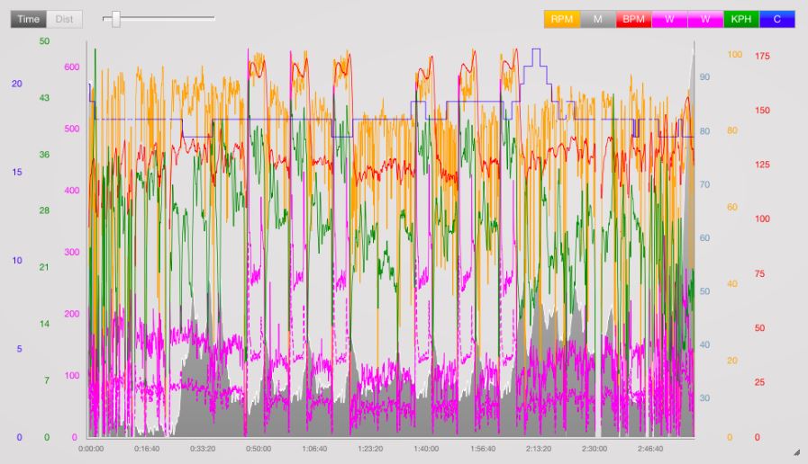
At the very top of my analysis page on Training Peaks I have the exercise graph. Here I can see a graphical representation of the training session and identify areas of interest, like intervals, and highlight them for individual analysis.

This graph gives a complete overview of the training session. It may look confusing but, over time, you will learn to identify areas of interest to understand how the session went  (Pic: Training Peaks)

From this graph I get a good overview of how the session went – for example, if power, heart rate and cadence slowly increased or decreased across the session. Over time you will learn to pick up any issues from this graph alone, which you can then investigate using other metrics and graphs.

I normally start with the big picture view and look at all the metrics listed, before looking through each individual effort within the ride and analysing them using the same metrics. This gives me a detailed insight into how the session went, what can be improved and where we need to take the training plan from here, with a view to a rider achieve their goals.

Peak Power graph

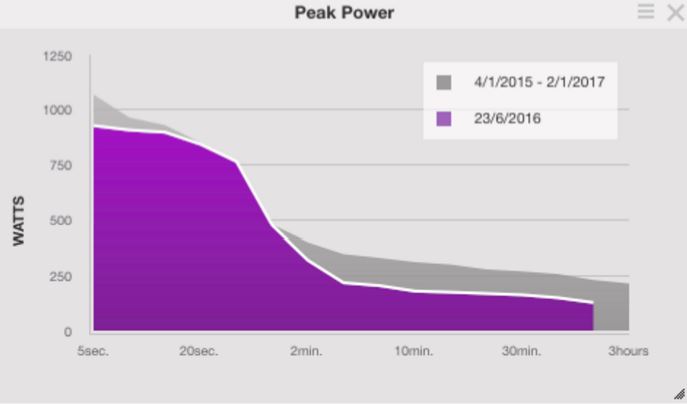
This graph allows you to plot your efforts in a session against your best-ever power outputs for a given duration.

The Peak Power graph plots your efforts in a session against your best-ever power outputs(Pic: Training Peaks)

Being able to compare your current form to your best ever form is really useful as you work on individual aspects of fitness. A great example of this is when introducing a focus on sprint work into your training plan in the build-up to the season. You will probably find that at first your sprint power isn’t great, but as you do more and more sprint sessions you will see your five and ten-second power starts to creep up towards your best-ever power outputs – and if all goes to plan, you will eventually score new PBs.

The Peak Power graph allows you to track this progress but, in addition, you can also pick the period to which you want to compare the individual session. For example, you could compare sprint power in January 2017 with that in January 2016 to see if you are ahead of where you were at the same point last season.

Power by zone

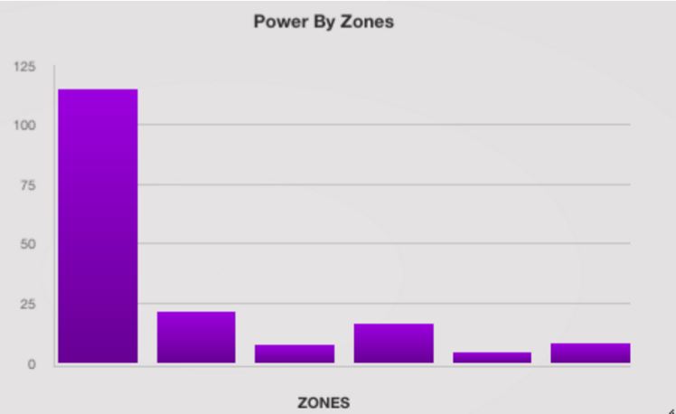
This is another really useful tool, this time for keeping track of polarized training. Polarized training is where you spend roughly 80 per cent of your time training in zone two and 20 per cent in zone four and above.

The power zone chart shows how long you spent in each training zone (Pic: Training Peaks)

If you read the scientific research on coaching, this method of training distribution outperforms any others – and it’s an important method that I use with my clients. This graph gives me a really good idea if an athlete is sticking to the training zones I have set – or if they are riding too easy at times and too hard at others.

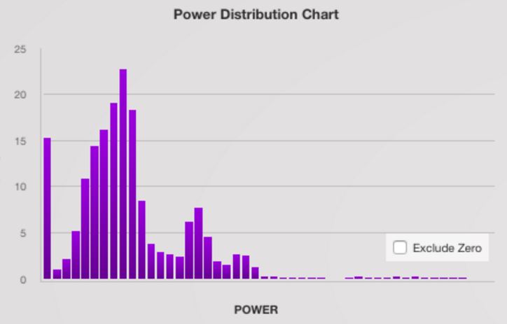
You can also use this chart to give a more detail view of how much time you spent in each five-watt band (Pic: Training Peaks)

I also use a more detailed power distribution chart which breaks power down into five-watt bands and shows exactly how much time was spent in each band. Comparing the two charts show exactly where within each zone a rider has been working.

Heart rate by zone

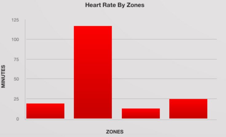
I typically use this chart in comparison with the power by zone chart, usually to double check if a rider’s heart rate zones are aligning with the power zones.

Use this chart alongside your power zone analysis to identify whether you’re coming down with an illness or are over-tired (Pic: Training Peaks)

If I see the heart rate and power zones don’t correlate – for example, if riding along in power zone two an athlete is riding in heart rate zone three – then I know something might not be quite right. It could be a sign that an athlete is coming down with an illness or that they have haven’t had enough recovery.

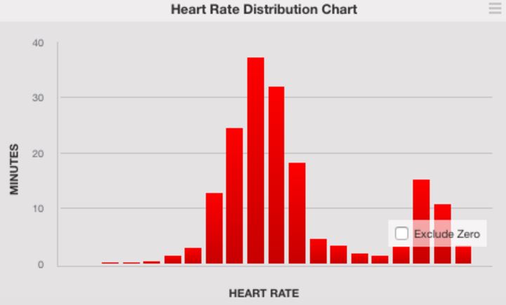
As with power, you can look at your heart rate distribution by 5bpm bands (Pic: Training Peaks)

You can also pick up on this using the Efficiency Factor, however it is good to have the data represented in two different ways to ensure you don’t miss anything. Just as with power, there’s a second chart, heart rate distribution, which breaks down heart rate in 5bpm bands.

Sponsored by
Newsletter Terms & Conditions

Please enter your email so we can keep you updated with news, features and the latest offers. If you are not interested you can unsubscribe at any time. We will never sell your data and you'll only get messages from us and our partners whose products and services we think you'll enjoy.

Read our full Privacy Policy as well as Terms & Conditions.

production