Share

Features

UCI WorldTour 2018: every team kit rated

Who will stand out in the peloton this season... and who has committed crimes against cycling fashion?

The 2018 UCI WorldTour season will be upon us imminently, with the Tour Down Under heralding the start of ten months of top-tier road cycling.

With 18 teams dining at men’s pro cycling’s top table and 37 WorldTour races in all, there will be no shortage of action through the year.

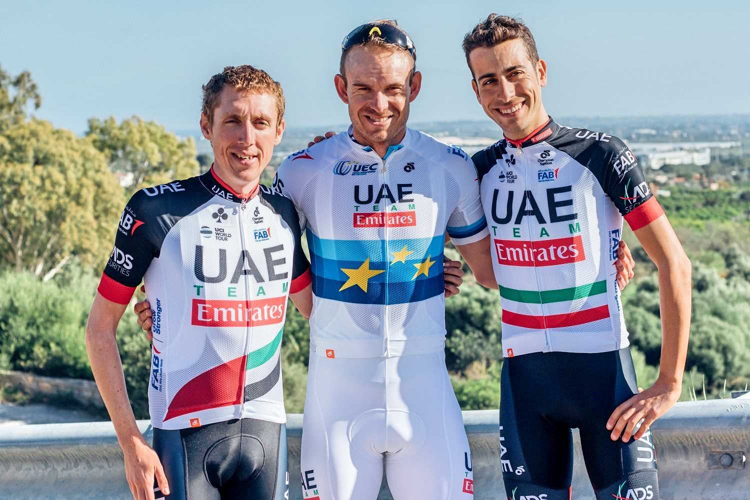
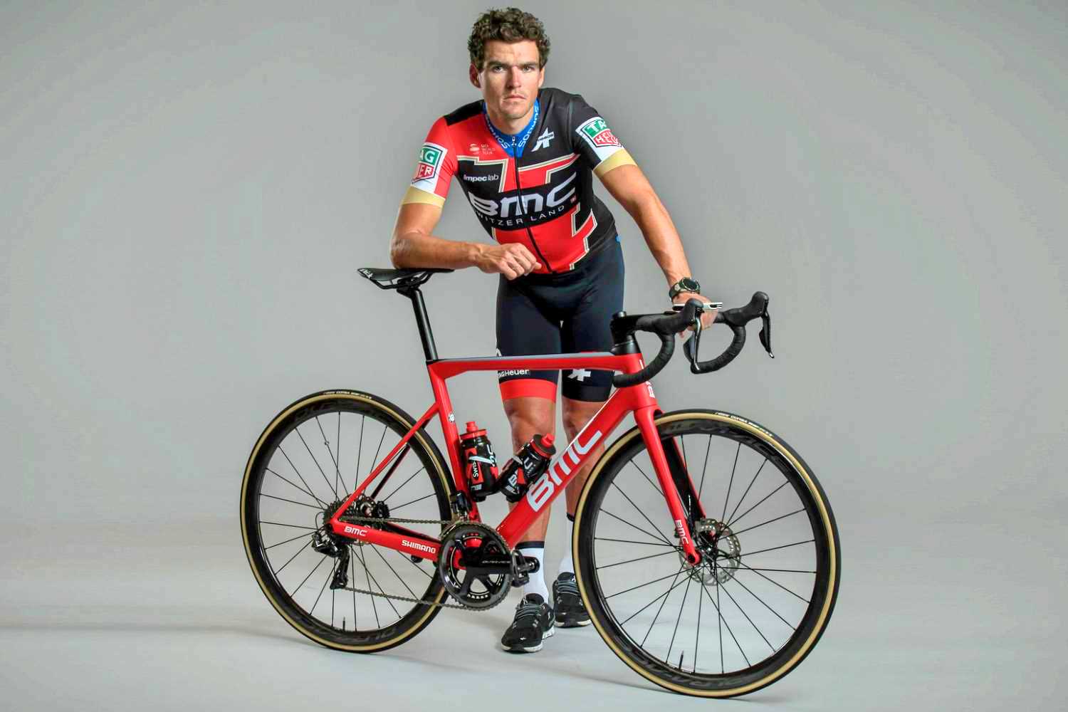
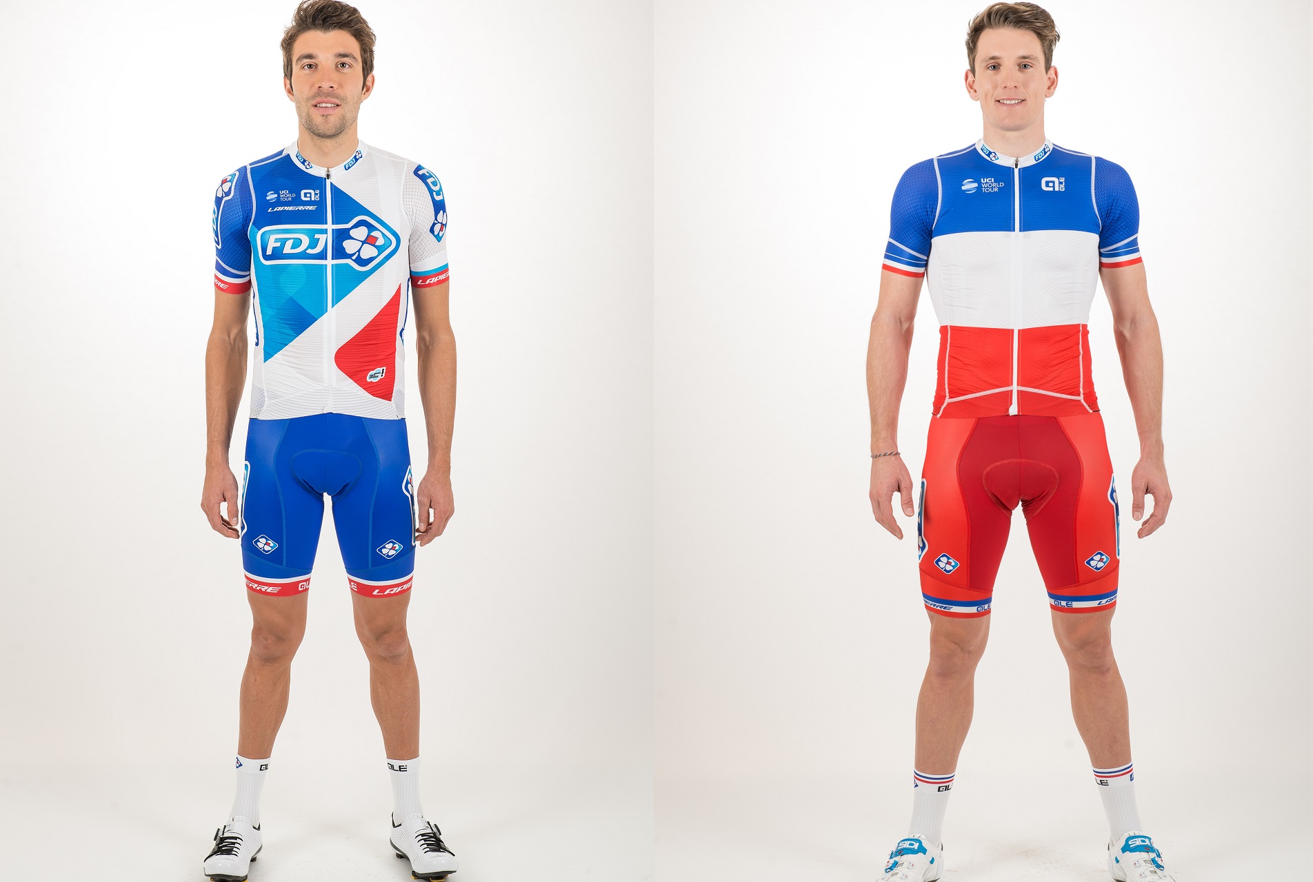
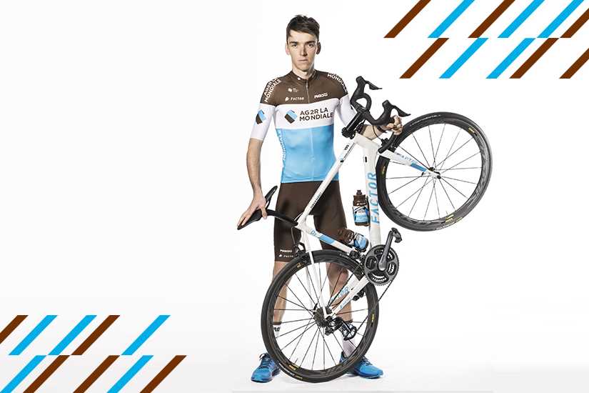
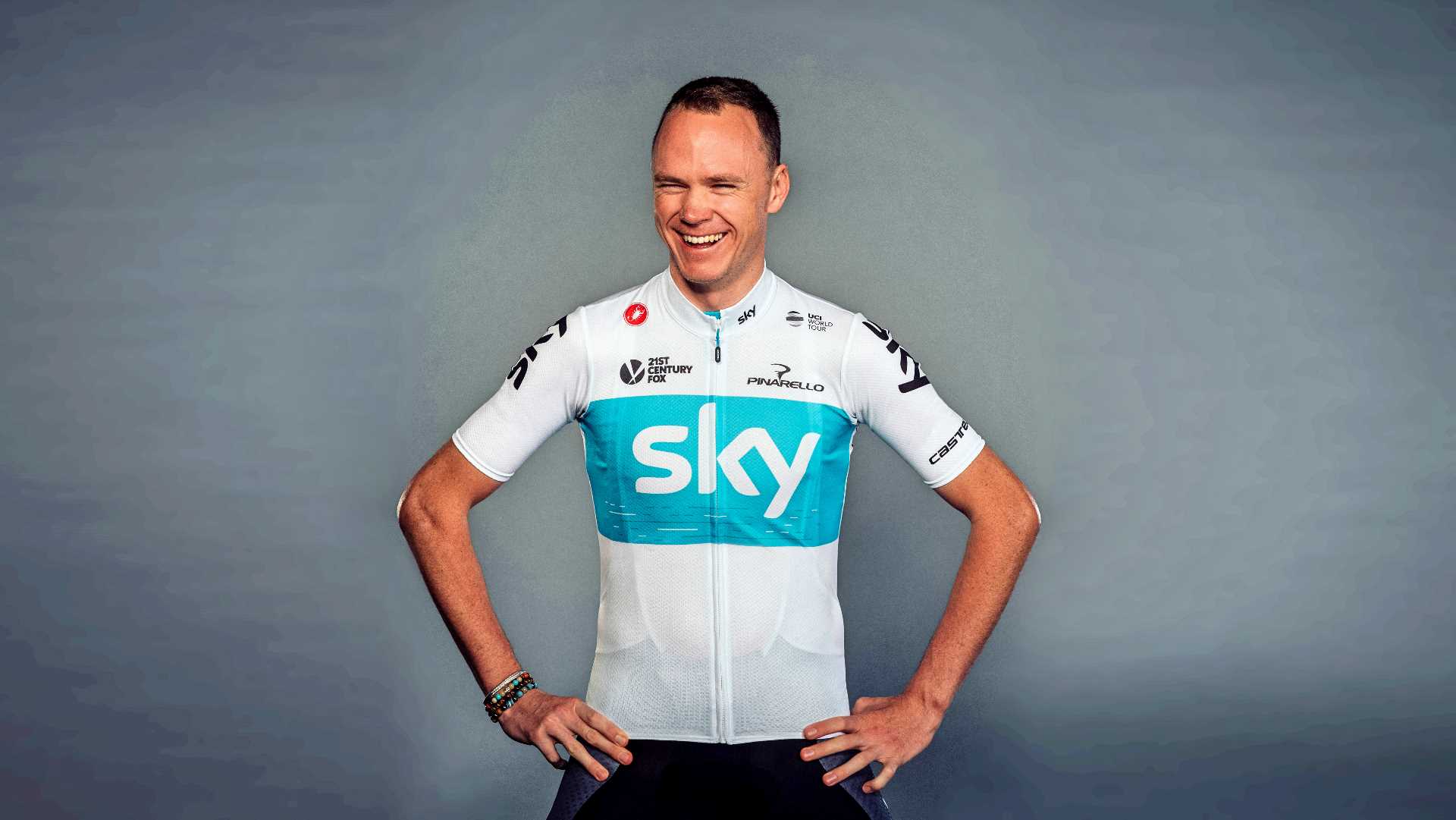
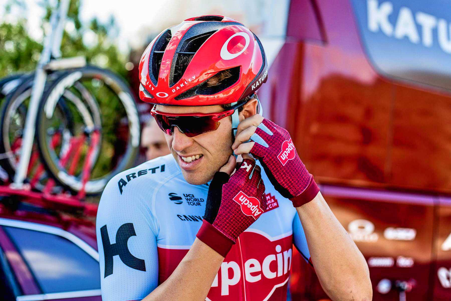
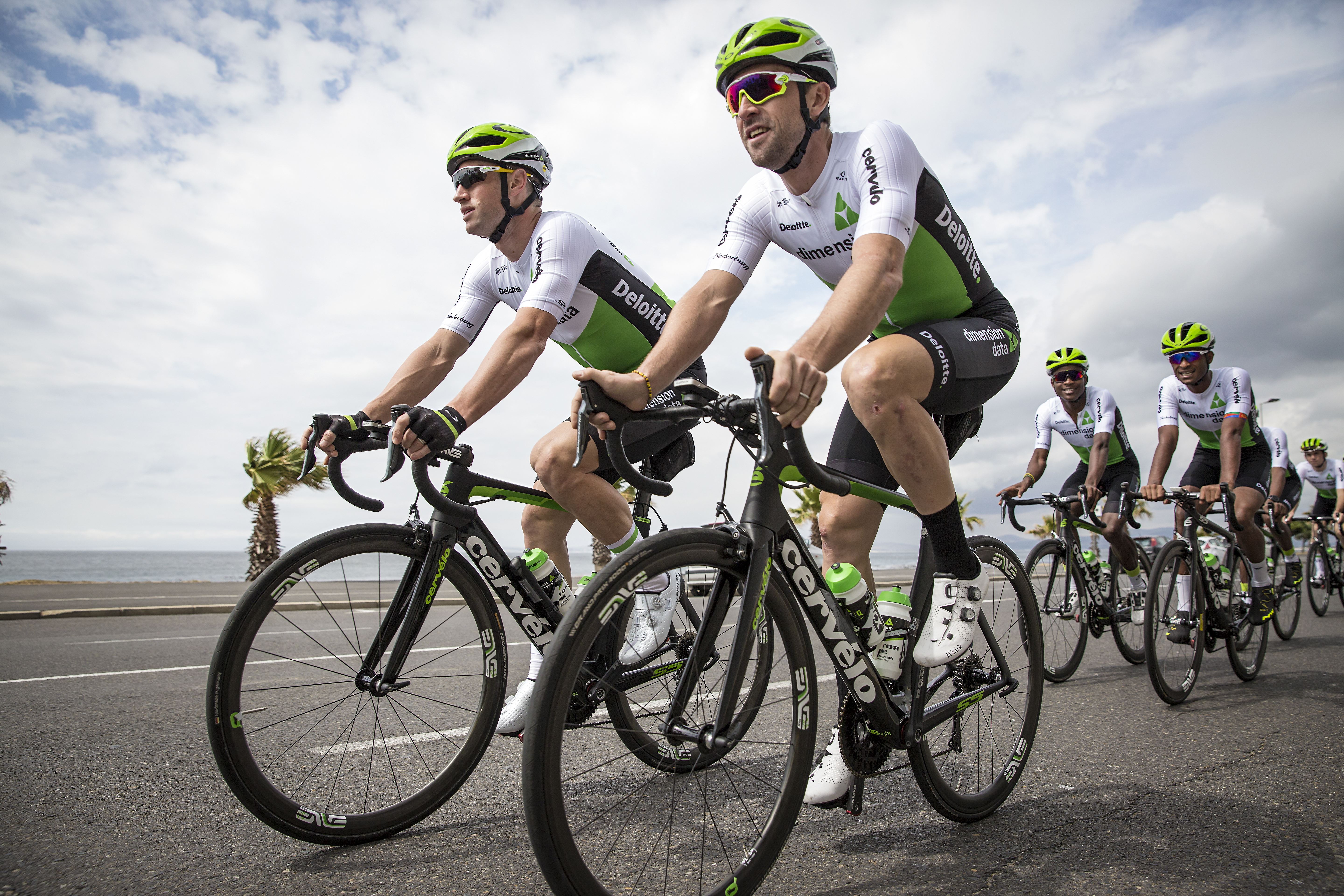
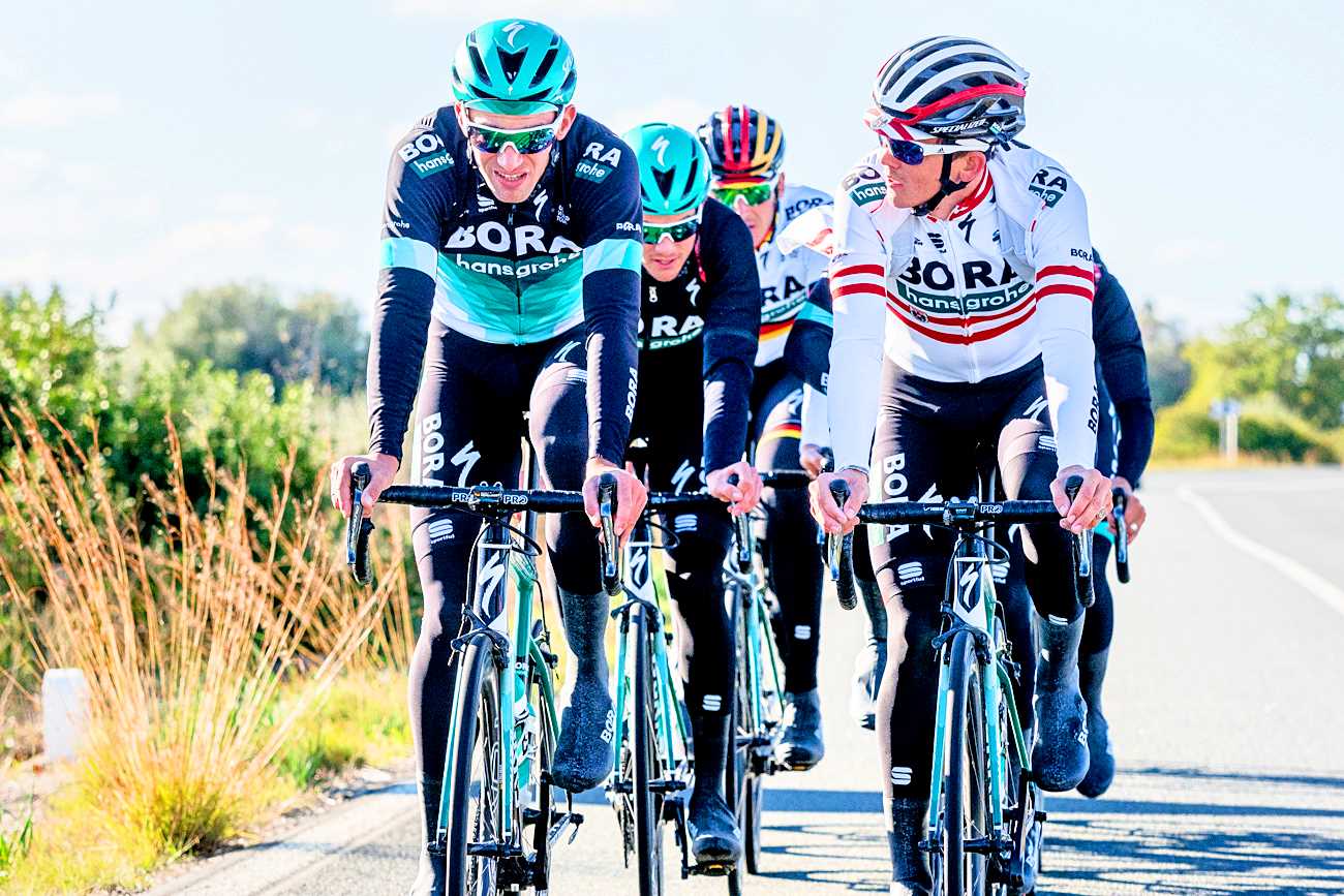
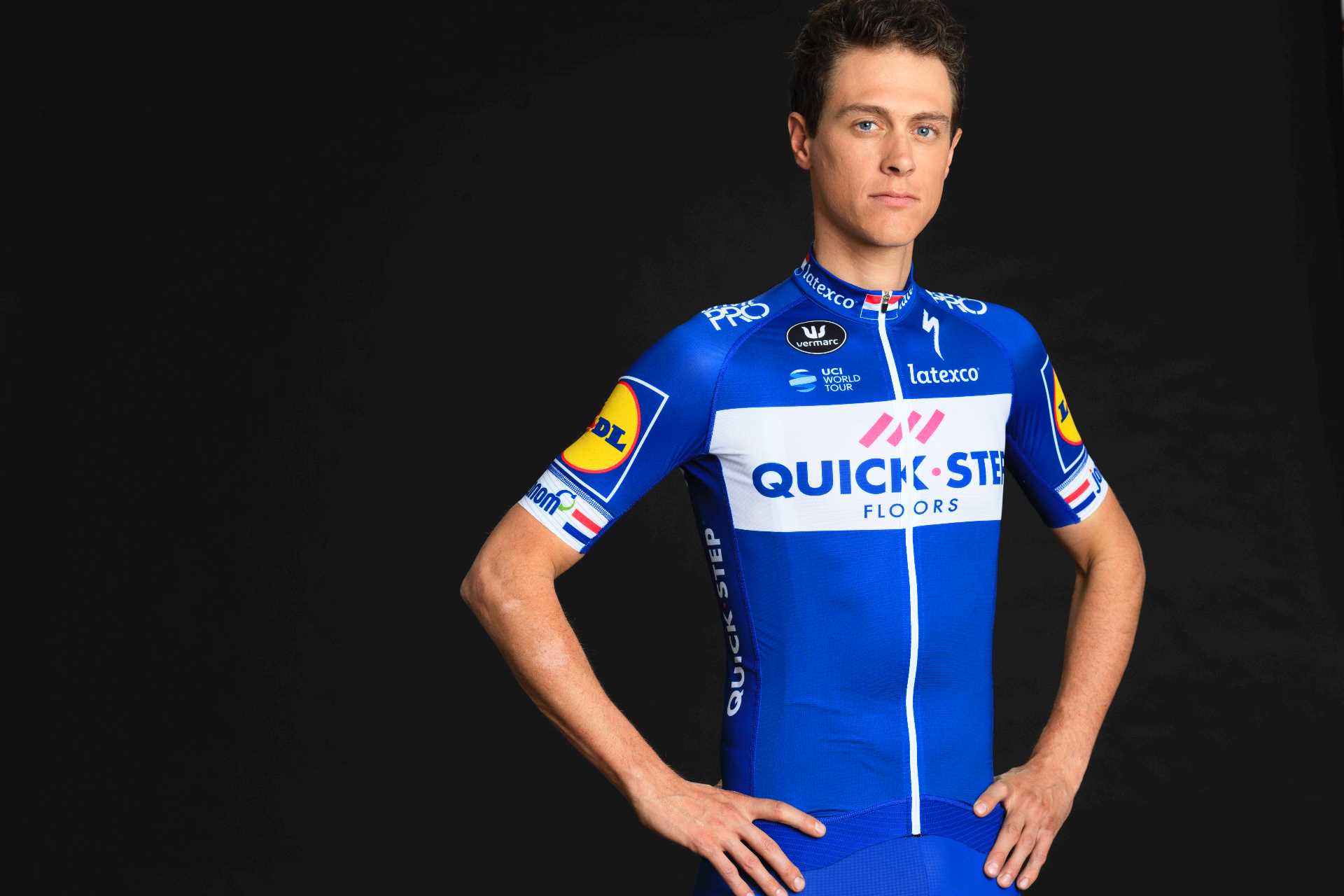
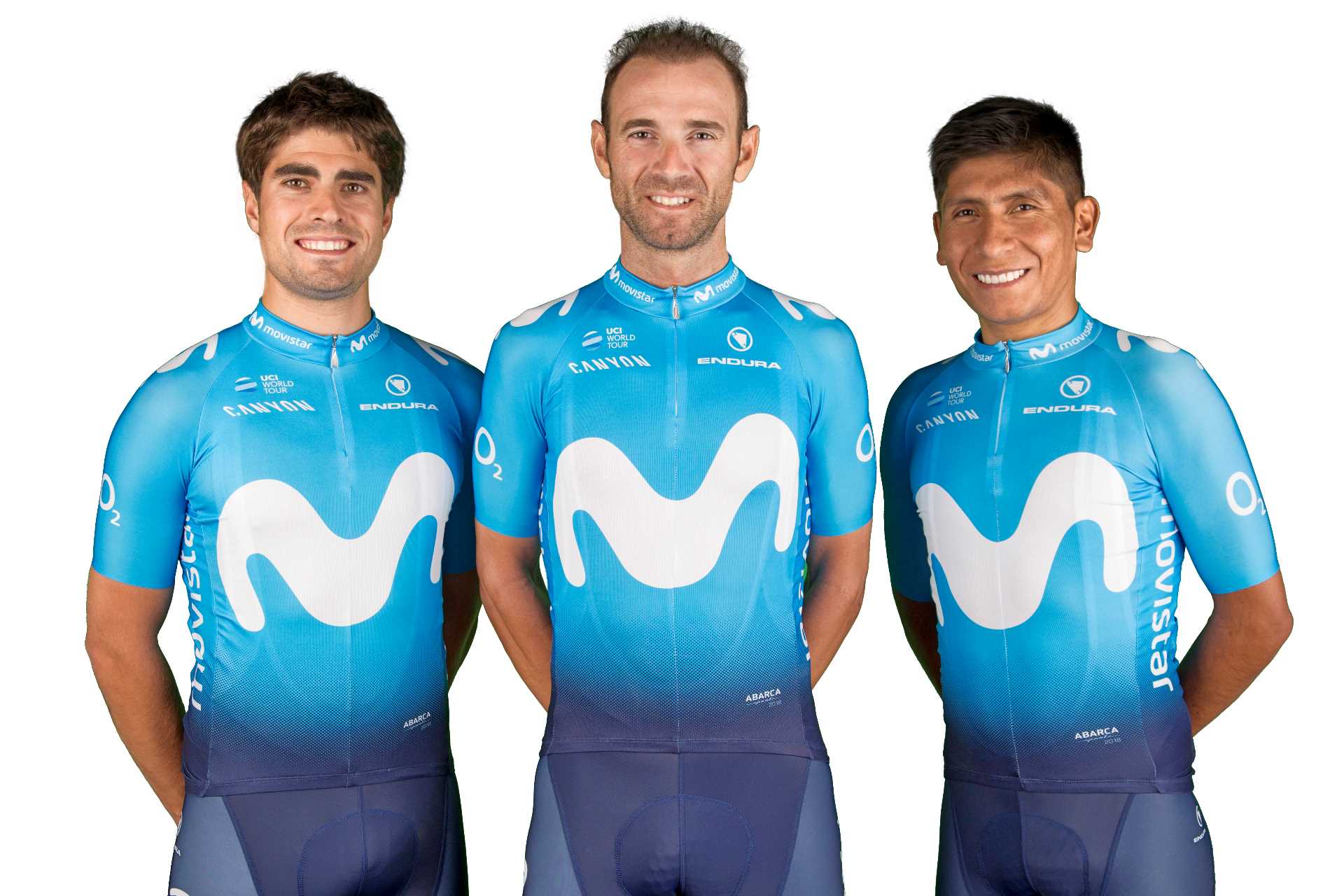
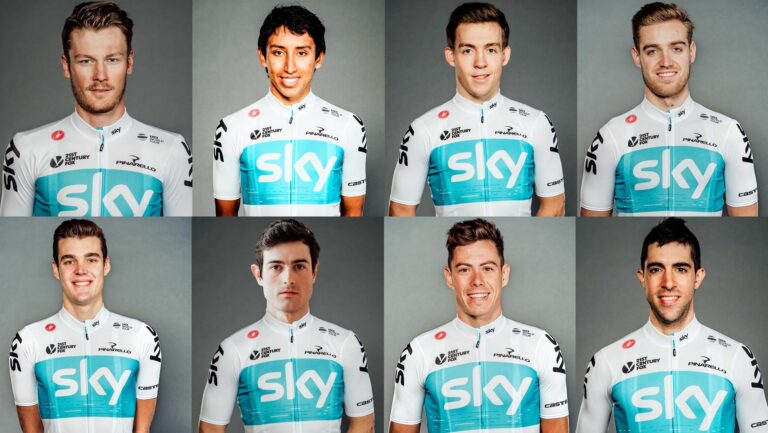
But, before the racing kicks off, there are plenty of kit changes to get your heads round first, with Team Sky swapping black for white and some blue sneaking into Katusha-Alpecin’s traditionally-red garb, for starters.

There will be some new looks in the WorldTour peloton with several teams, including Team Sky, unveiling new jerseys (Pic: Team Sky)

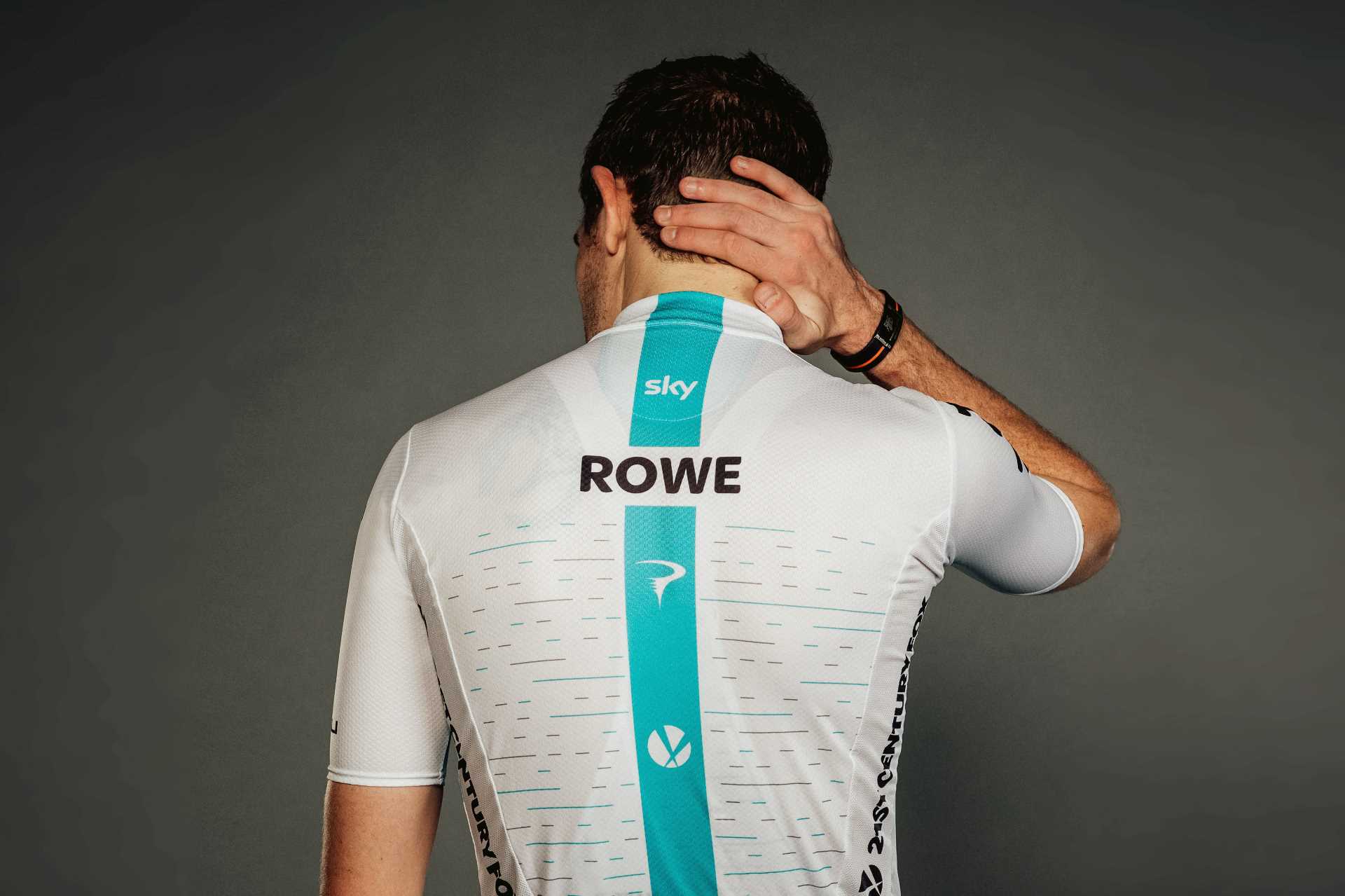
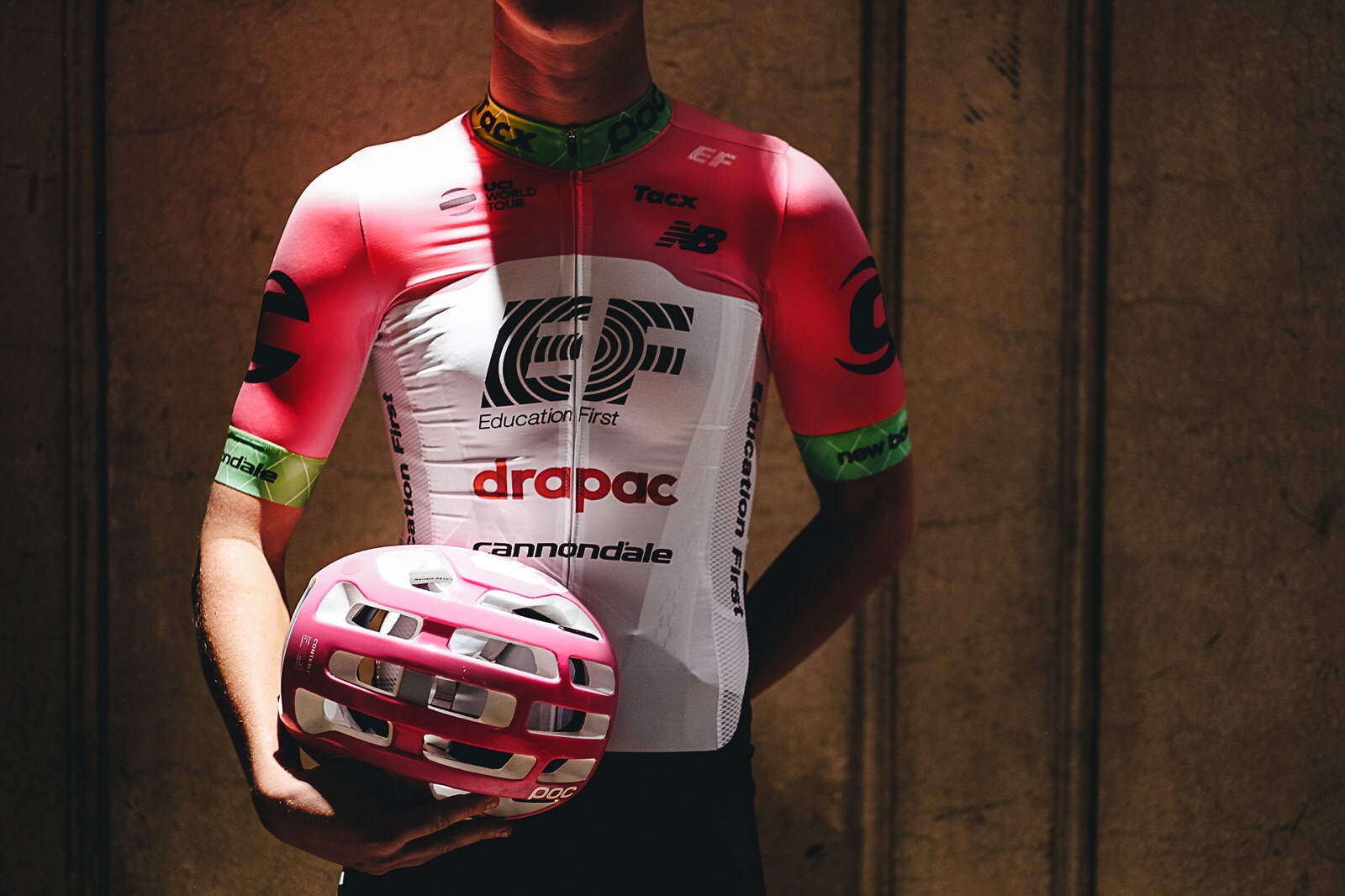
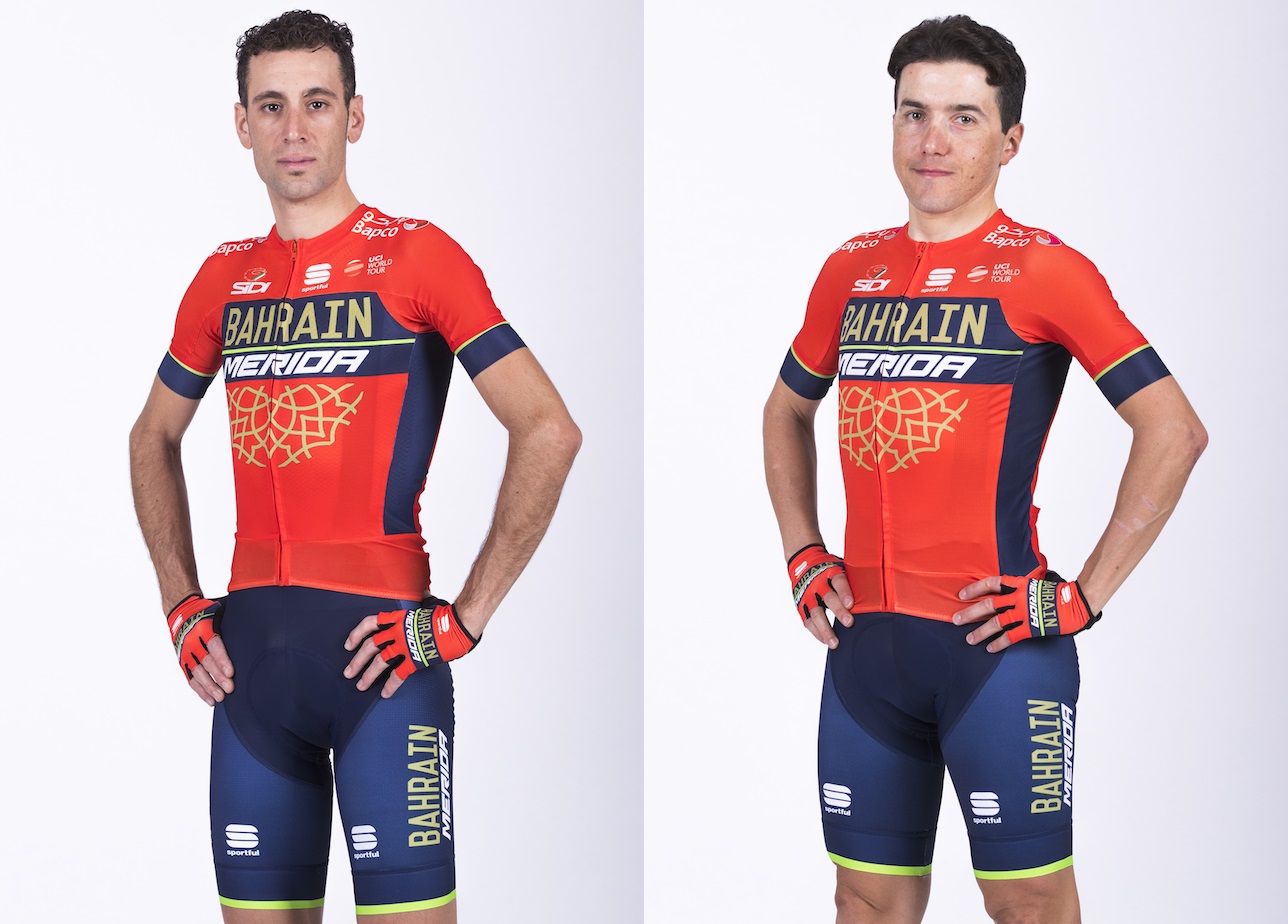
To help you out with spotting your favourite teams and riders in the bunch this year, we’ve run through every WorldTour kit below – and ranked them from worst to best.

Who will stand out in the peloton this season… and who has committed crimes against cycling fashion? Let’s take a closer look – and vote for your favourite kit at the bottom.

18) UAE-Team Emirates

Only a cursory glance through this article will reveal three major themes – pro teams and sponsors seemingly love black kits, white kits and red kits.

There’s nothing wrong with that – well, at least not black and red, we’ll get to white later – but it’s not great for spectators when every team almost looks the same, especially from above.

UAE Team Emirates unveiled white shorts for Alexander Kristoff and a minimalist Italian champion’s flag on Fabio Aru’s jersey (Pic: UAE Team Emirates)

Some teams have found ways to cut through the visual noise, but not UAE Team Emirates, whose kit is predominantly white, with black sleeves and red cuffs.

It’s tidy, and the Emirati flag is a neat touch, but it’s nothing special. They would have ranked higher, however, were it not for European champion Alexander Kristoff’s white shorts (just no!) and Fabio Aru’s scandalously minimal Italian champion’s kit, pictured above.

Since that photo was released – and the public outcry that followed – Aru’s jersey looks to have had a redesign, but the original shouldn’t have seen the light of day in the first place.

17) BMC Racing

In the past, we’ve had no problem with BMC Racing’s red-and-black kit; an iconic design in the WorldTour peloton having been the team’s colours since the start.

But then they went and ruined it last season by slapping two massive Tag Heuer logos on their sleeves, which took away from the previously clean look of the jersey.

Greg van Avermaet models BMC Racing’s sponsor-laden jersey (Pic: BMC Racing)

Olympic champion Greg van Avermaet’s smart gold cuffs made for a classy touch but then, as if to prove you can never have too many sponsors, they’ve gone and stuck a blue collar on, too, thanks to the addition of cybersecurity firm Sophos to the ranks.

Though we have absolutely no problem with more sponsors in pro cycling – Tag Heuer and Sophos’ support for the sport is more than welcome – BMC’s jersey is starting to resemble an office noticeboard, and it’s a firm no from us.

16)  Lotto-Soudal

Lotto-Soudal struck gold with a classy throwback look a few seasons ago now, and every kit since has been a variation on that theme. This season is no different, though the jersey has more white than it used to – think Faema’s iconic 1970s number.

What do you think of the @lotto_soudal shirt for 2018? We unveiled the shirt yesterday with help from #captainsofcycling @puckmoonen and @nikolasmaes! #photonews #season2018 #shirtdesign @vermarcsport

A post shared by Lotto Soudal (@lotto_soudal) on

Unfortunately, however, while it’s business as usual at the front, the back of this year’s jersey leaves less to be desired. Giant bubbles (supposedly representations of Lotto balls) cover the rear pockets of the jersey.

We don’t like the Lotto balls used by the Dutch LottoNL-Jumbo team, but we dislike abstract representations of Lotto balls even more – especially when it undermines such a classy kit. Two stars.

15) FDJ

FDJ were bottom of the pile in our kit round-up last year, when they opted to match the tricolore jersey with, ahem, white shorts.

They’ve swapped white for blue this year, however, which marks a vast improvement on the previous effort – though their kit could change again after the spring, when new sponsor Groupama comes on board.

FDJ have reverted back to blue shorts, alongside a traditional French champion’s jersey for Arnaud Demare (Pic: FDJ)

FDJ also get added points for their classy national champions’ jerseys – French champion Arnaud Demare rolling out in a sponsorless, blue, white and red, while Dutch counterpart Ramon Sinkeldam will wear the reverse red, white and blue – but we’re still not bowled over by the regular kit.

14) Ag2r-La Mondiale

Ag2r-La Mondiale have made some tidy adjustments to their jersey for 2018, with their sponsors’ diamond pattern replaced by brown, white and blue blocks. The sky blue is also a nice touch, having crept more and more into the kit in the last couple of seasons.

More blue for Ag2r-La Mondiale in 2018, but those polarising brown shorts remain (Pic: Ag2r-La Mondiale)

But we’ve said it repeatedly before – those brown shorts, which have polarised opinions for several years now, are just not our cup of tea.

The jersey is a winner, and the colour scheme is instantly recognisable as Ag2r-La Mondiale – we just can’t change our opinion of those shorts.

13) Team Sky

Team Sky have broken with tradition for 2018, with their Castelli kit swapping from black to white for the new season.

Now don’t get us wrong, the kit looks nice, the large blue panel across the front and blue stripe up the back are distinctively Sky, and the black shorts make it a very tidy get-up.

Team Sky’s Castelli jersey is white for 2018 (Pic: Team Sky)

It looked smart when Team Sky used a variation of the kit as a one-off during the 2017 Tour de France, too – in fact, the new version, with added blue, is nicer in our opinion.

But the season isn’t confined to a month in July – and we wouldn’t want to be consigned to laundry duty when the kits have been hammered by the Spring Classics. And therein lies the problem with white jerseys.

12) Team Sunweb

Team Sunweb’s kit might look familiar to those who paid close attention to the pro peloton last season… and that’s because it is. It’s exactly the same.

The kit, which Tom Dumoulin swapped for the maglia rosa at the Giro d’Italia, is back again for 2018. That means there’s the same boy racer stripes up the front – now representing the team’s men’s and women’s team time trial victories in 2018, apparently. We might believe them a bit more if they hadn’t already been on the kit last season.

Team Sunweb have stuck with the tried and tested (Pic: Cor Vos/Team Sunweb)

A flash of red from sponsors Sunweb and you have a pretty generic black, white and red kit that, while recognisable as the team’s colourway, won’t win any prizes from us.

11) Team EF Education First-Drapac p/b Cannondale

Let me start, perhaps unusually considering I’ve placed it close to mid-table on the RCUK kit-o-meter, by saying I don’t like this kit.

However, Education First’s justification for the ‘disruptive pink’ colour is to make them stand out in the peloton – and it will certainly do that, so you can’t really fault them.

Team EF-Drapac will undoubtedly stand out in the peloton (Pic: EF-Drapac)

Fuschia and green has been tried before by Lampre-Merida, and it polarised opinion then too. That’s confined to the chest and sleeves though, with this kit having more white and traditionalist-pleasing black shorts.

The team has also launched a training kit, which swaps pink for orange (to offer an even more high-visibility option when training), which is all very sensible. As for the race kit, it’s not my cup of tea, but I can’t fault the thinking behind it.

10) Mitchelton-Scott

With a new title sponsor on board, the team that spent much of its life in cycling’s top tier carrying the Orica moniker will roll out as Mitchelton-Scott next season. And that means another change to their kit, which goes from last year’s navy-and-yellow to a primarily black number.

A change of title sponsor means a change of kit colour for Mitchelton-Scott (Pic: Mitchelton-Scott)

This isn’t any old black kit, though. The yellow shoulders, collar and cuffs – along with the yellow of Scott’s logo – will ensure it’s easy to spot when Caleb Ewan comes charging through for a bunch sprint, or when Adam and Simon Yates are dancing up mountains.

It’s not too dissimilar in some senses to the old Endura kit which graced the British domestic calendar earlier in the decade – though if we had to, we’d choose this one of the two.

9) LottoNL-Jumbo

LottoNL-Jumbo’s yellow-and-black get-up arrives for 2018 with very little new to report, though the kit is now made by Shimano through the Japanese firm’s flagship S-Phyre range.

Vifit’s logos have also been added to the outside of the sleeves – showing Tag Heuer how to get involved with a jersey design without taking over.

LottoNL-Jumbo’s kit has not changed too significantly from previous editions (Pic: Vifit Sport)

But there’s not much else to say given the similarity to last year’s efforts – the Lotto balls remain, but once again they are less garish than in previous years and tie in nicely with the rest of the jersey, as far as Lotto balls go.

8) Katusha-Alpecin

Katusha-Alpecin’s first year saw a coral-and-red kit unveiled last season, and this year they have slapped some light blue shoulders on it too. Why? We don’t know, but it’s a head-turner that’s for sure.

Alex Dowsett models Katusha-Alpecin’s new kit (Pic: Katusha-Alpecin)

Now, in truth, this could go either way – by the end of the season we could decide it’s too garish and doesn’t work, or it could grow on us.

So, for now, we’re playing it safe and sticking it somewhere in the middle – change can be refreshing, but we’re not convinced we completely love this one… yet.

7) Bahrain-Merida

Bahrain-Merida’s debut kit last season was a smart red-and-navy design with gold patterning to represent the new sponsor. This year they’ve, well… they’ve done exactly the same thing again. It’s one way to build a brand, anyway.

Bahrain-Merida have stuck with their debut kit design for 2018 (Pic: Bettini Photo/Bahrain-Merida)

The argument would be if it ain’t broke, don’t broke fix it – though we’re sure Vincenzo Nibali would like to swap it for some leaders’ jerseys in 2018.

6) Trek-Segafredo

Trek-Segafredo’s Sportful kit has changed from last year’s red-to-black design to an all-red jersey with white logos and, as we’ve come to expect from the team, pin stripes.

Paired with black shorts, it’s a typically stylish get-up from Sportful who have made some of the nicest kits in the pro peloton in recent years.

Trek-Segafredo’s kit is more red than before, but the pinstripes remains (Pic: Santini)

Why, then, is not our favourite? Well, we’re being picky, and to be perfectly honest we preferred last year’s red and black number to this one.

In short: it’s good, but is used to be better.

5) Dimension Data

It may be hypocritical of us to rate Dimension Data’s kit so highly, having been critical of the other white jerseys in the bunch, but we’re big fans of the green which has grown in dominance for 2018.

It’s very on-brand for their leading sprinter, former Tour de France green jersey winner Mark Cavendish, of course, and in a peloton of black, white, red and blue it certainly helps the team stand out.

Dimension Data’s new jersey features more green than before (Pic: Scott Mitchell/Dimension Data)

Throw in the Qhubeka logo on the back, and it’s a reminder of the amazing things Africa’s team does to support the charity.

The shorts are classic black, too, though Dimension Data’s social media team had traditionalists foaming with rage when they jokingly ‘unveiled’ white and green versions on Twitter.

Hopefully that joke hasn’t given anybody ideas…

4) Bora-hansgrohe

Bora-hansgrohe have changed their predominantly black debut kit of 2017 by adding in a great deal more green for the new season. An inverted triangle fades to white with the new pattern, which is a winner compared to last year at any rate.

Bora-hansgrohe’s 2018 kit includes more green than before (Pic: Bora-hansgrohe)

They’ve also done well to keep world champion Peter Sagan in black shorts with his rainbow bands – a vast improvement on the white he opted for at Tinkoff in his first year as world champ.

It’s a solid effort, in our view, though the predominantly black shoulders will be nothing special when the team’s racing full gas, on the drops, to set Sagan or Sam Bennett up for a bunch sprint.

3) Astana

Last year’s winners have stuck with sky blue jerseys and black shorts for 2018, with only minor tweaks to the design – including removing the fade into the shorts.

We liked it a lot last season, and nothing we saw during the year changed our opinion on that front.

Jakob Fuglsang looks pleased with Astana’s 2018 kit effort (Pic: Astana)

They did a great job of Fabio Aru’s Italian champion’s jersey too – which Aru’s new UAE-Team Emirates team would do well to note.

But we’re suckers for new kit at RCUK, and, well, Astana’s 2018 effort is just too 2017.

2) QuickStep Floors

QuickStep topped the charts when we ran the rule over the peloton’s kits in 2015, but the blue shorts that followed a year later saw the Belgian squad abruptly lose that crown.

While the blue still remains, along with over-sized Lidl logos, the kit now uses a darker shade to propel the team up our charts. There’s less white, too, which is no bad thing.

Niki Terpstra strikes a pose in QuickStep-Floors’ darker kit (Pic: QuickStep)

In truth, the blue has grown on us and, though we weren’t massively taken by last year’s effort, this one is a winner in our eyes.

Or, at least, it would have been had there not been one more kit we prefer…

1) Movistar

Movistar has been rebranded – that’s the phone company, not the team of Nairo Quintana – which means Movistar the team has followed suit.

Out goes the navy blue jersey and massive green logo of old, and in comes a much lighter blue fade jersey paired with dark navy shorts.

Movistar should stand out on the kit front in 2018, having adapted their colours to match their title sponsors’ rebranding (Pic: Movistar)

In truth, it bears more than a passing resemblance to Astana’s kit, which topped last year’s charts and is largely unchanged this year.

But with Movistar’s kit being radically new, and Astana’s not, we’re going to be fickle and place the Spanish team top of the pile for 2018. Top marks.

Vote for your favourite kit

We’ve had our say, now it’s time for you to vote for your favourite kit.

What is your favourite WorldTour team kit for 2018?

Ag2r-La Mondiale
Astana
Bahrain–Merida
BMC Racing
Bora–Hansgrohe
Dimension Data
EF Education First–Drapac p/b Cannondale
FDJ
Katusha-Alpecin
LottoNL-Jumbo
Lotto-Soudal
Mitchelton–Scott
Movistar
QuickStep Floors
Team Sky
Team Sunweb
Trek–Segafredo
UAE Team Emirates

Survey Maker

Newsletter Terms & Conditions

Please enter your email so we can keep you updated with news, features and the latest offers. If you are not interested you can unsubscribe at any time. We will never sell your data and you'll only get messages from us and our partners whose products and services we think you'll enjoy.

Read our full Privacy Policy as well as Terms & Conditions.

production